
Bowers & Wilkins Unveils Its New Colors
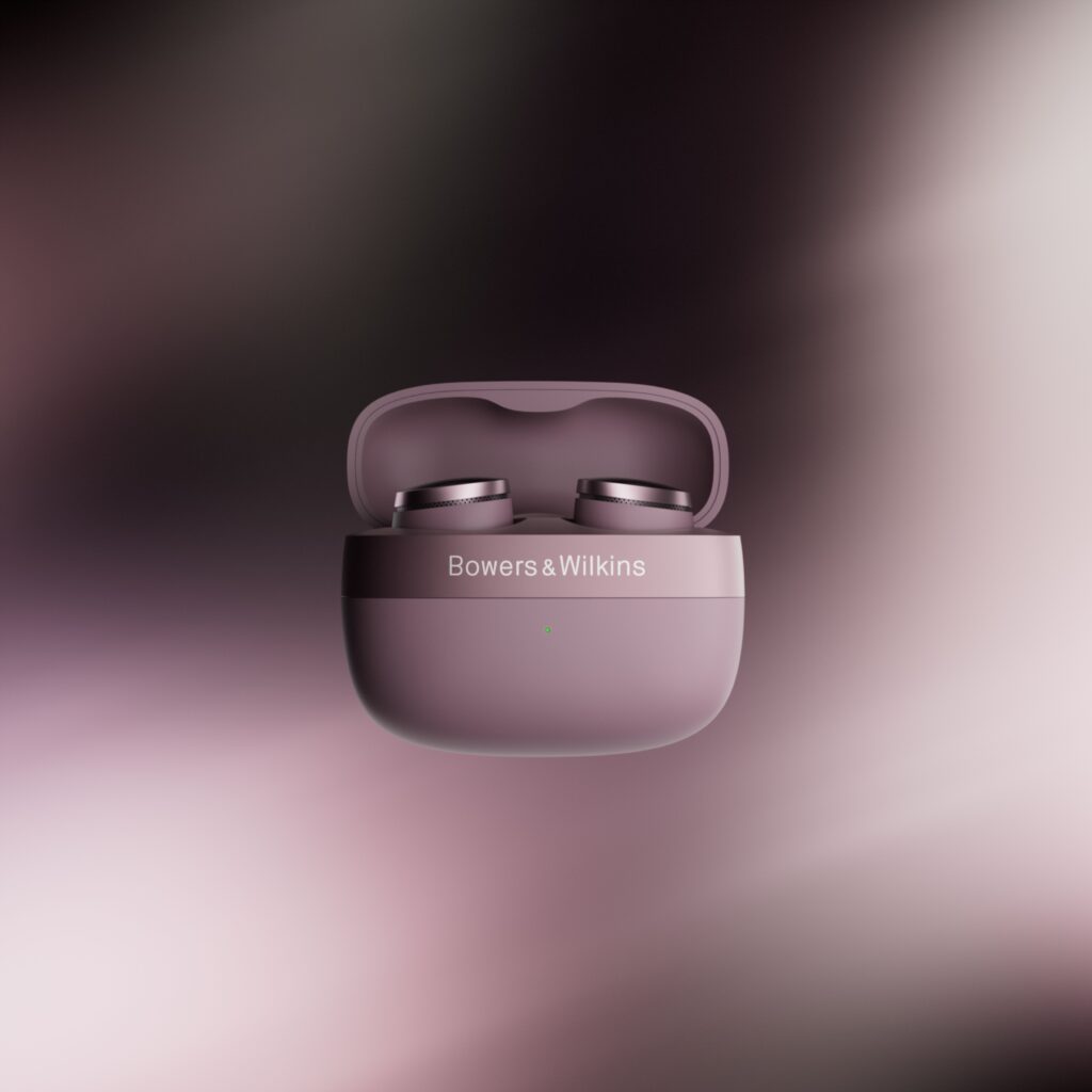
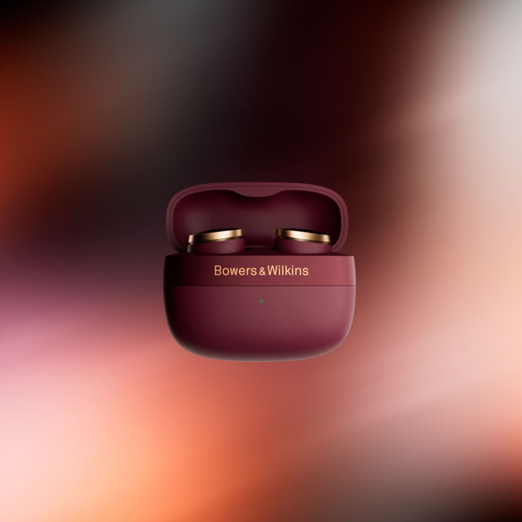
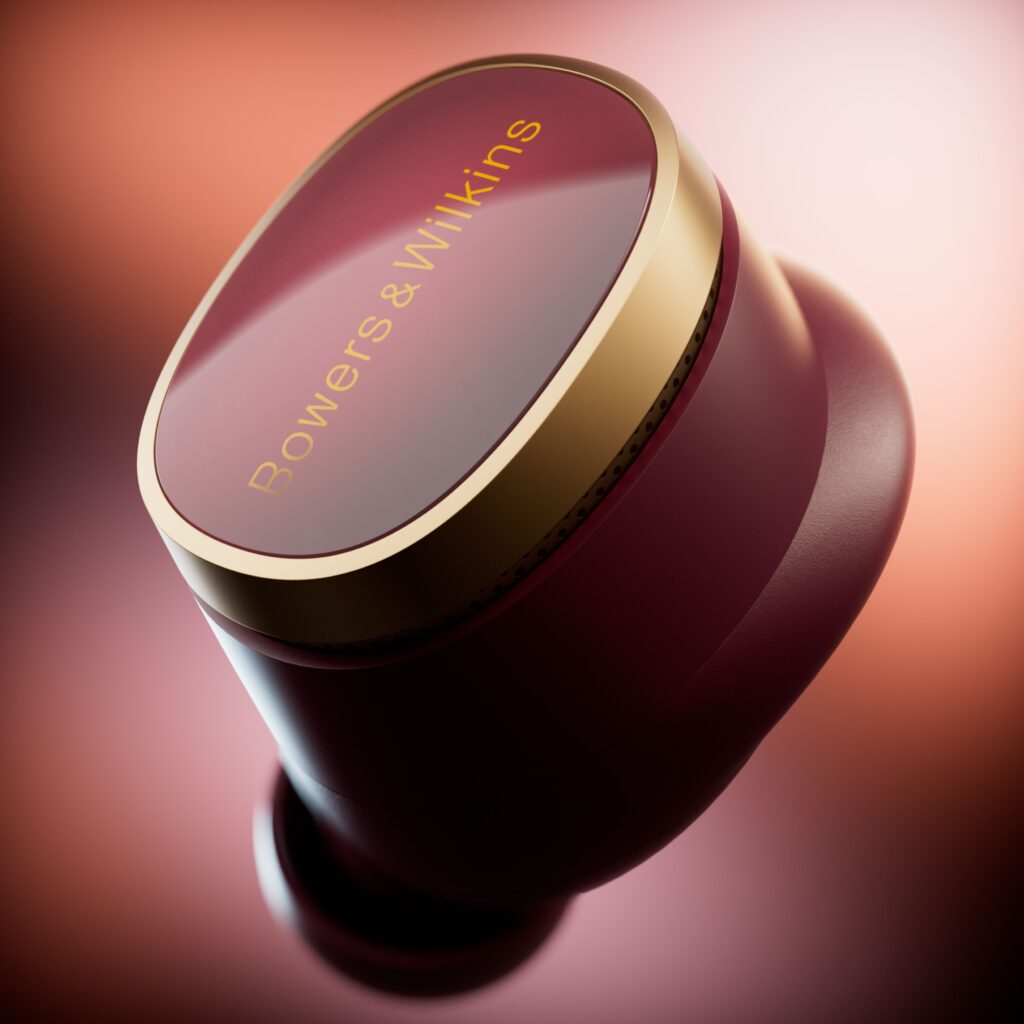
There are objects we listen to, and others we look at. Bowers & Wilkins has decided that its products deserve both kinds of attention. With the introduction of new color options across its lineup, the British brand isn’t just offering a choice of colors—it’s sparking a conversation about what it means to own a luxury audio product today.
The object that speaks for itself
It took the audio industry some time to recognize what the furniture and fashion industries had long understood: color isn’t merely decorative; it defines identity. At Bowers & Wilkins, this realization has resulted in a range of colors designed not to catch the eye on store shelves, but to complement contemporary interiors—the light tones of Nordic minimalism, the warm accents of updated Haussmann-style apartments, and the dark, matte palettes of sophisticated workspaces.
The brand, founded in 1966 in Worthing, Sussex, has built its reputation on engineering precision that is beyond question. But precision can be cold. Color, on the other hand, adds warmth—it invites the object into the home in ways other than just through sound. It gives it a visual presence that matches its acoustic presence.
Bowers & Wilkins is aligning its product strategy with that of major brands that have realized hardware can become an accessory. Collaborations between tech brands and designers—such as the Beats x Sacai headphones and limited-edition Marshall speakers—have opened up a space where B&W can position itself with a legitimacy that few of its competitors possess.
Because the brand has what others don’t: a deep-rooted acoustic heritage, a clientele accustomed to excellence, and products whose design seamlessly complements color rather than being overwhelmed by it. When a pair of Px8 headphones or a speaker from the 600 series changes its color, it’s not a marketing ploy—it’s a reinterpretation. The same instrument, seen in a new light.
Color as a language of care
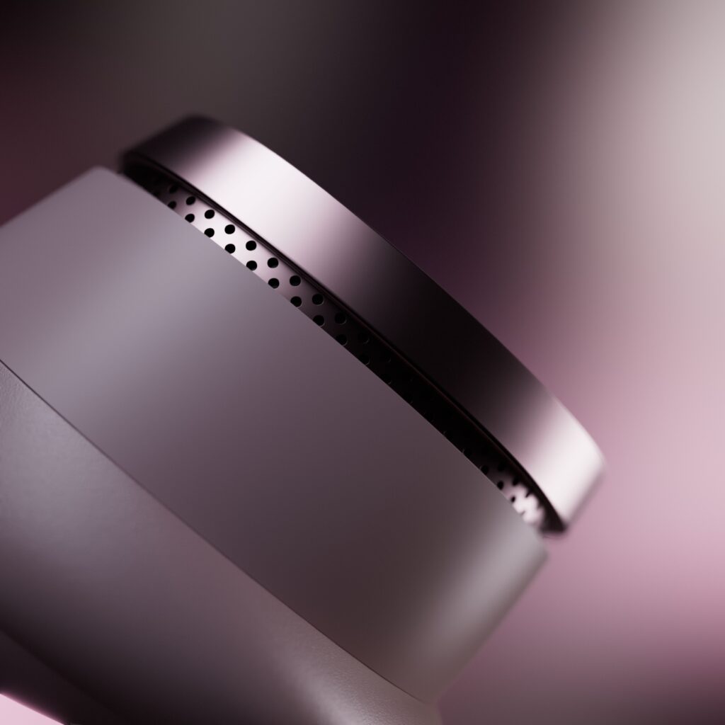
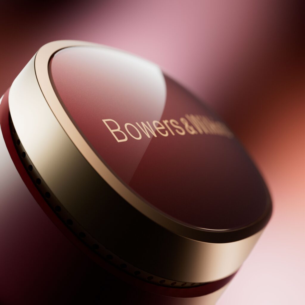
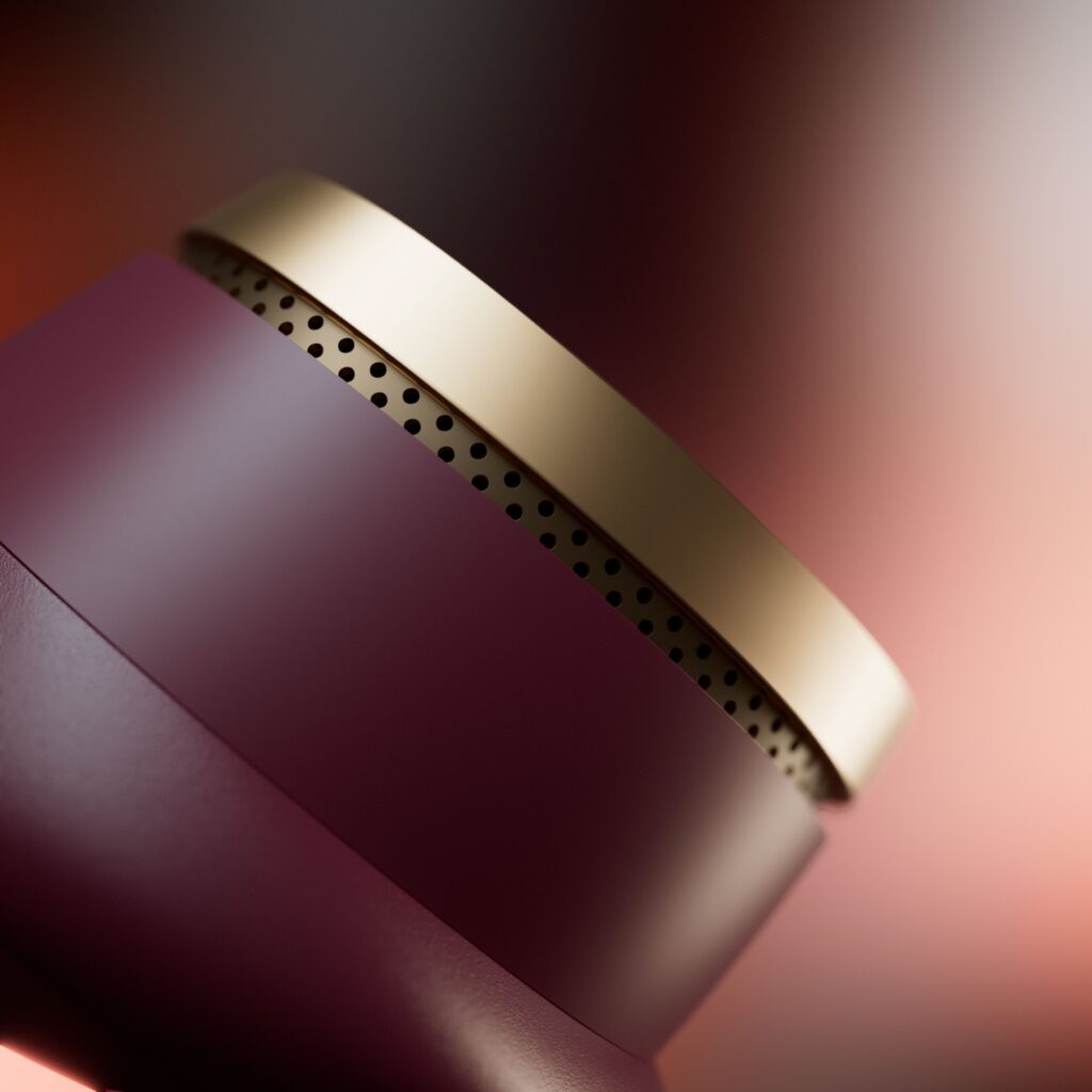
There is something almost sensory about the way Bowers & Wilkins approaches this color collection. The shades don’t seem to have been chosen at random or based solely on market research—they convey a specific intention. A warm neutrality reminiscent of trend books from interior design firms. A depth that doesn’t scream for attention but lingers in the memory.
This is an approach found among leather artisans and jewelers who understand that restraint does not mean the absence of color, but rather the refusal to make color a spectacle. B&W doesn’t flaunt its new shades—it presents them with the understated elegance of well-crafted objects. The kind you notice at second glance, and never regret seeing at first.
It’s also worth noting that this approach comes at a unique moment in the high-end audio industry, where competition between established players and new entrants is playing out as much in the realm of design as in that of performance. Sonos, Devialet, Focal—each is seeking to define its own aesthetic. B&W, for its part, is returning to its fundamentals with quiet confidence: form first, always designed with sound in mind, but now also ready to catch the eye.
Ultimately, these new colors raise a question that the audio industry is still hesitant to ask openly: What is a luxury audio product in the 21st century? Technical performance, of course. But perhaps also something that deserves to be noticed even before you turn it on.










Cette publication est également disponible en :

