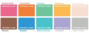
Pantone LLC, the world’s leading color authority, presents its PANTONE® Fashion Color Report Spring 2011. Available free of charge at www.pantone.com/spring2011, the report presents the top 10 women’s fashion colors for Spring 2011 and illustrates them with sketches, quotes and photos from leading designers. The publication of the report coincides with New York Fashion Week, and follows the presentation of the PANTONE UNIVERSE™ collection, an ever-richer range of design products, specially dedicated to the general public, at the Maison & Objet trade fair.
Here are the 10 key colors for spring 2011:

“The colors chosen by the designers for spring express an interesting and unexpected marriage between warm and cool tones,” says Leatrice Eiseman, director of the Pantone Color Institute®. “By subtly combining complementary colors that are opposites on the chromatic scale, they have created a palette of striking intensity. These unique combinations will make it possible to choose autumn-toned garments from your wardrobe, and combine them with new pieces to create spring ensembles.”
Complementing the designers’ contributions, the report is enriched by comments from fashion gurus and leading retailers about the places and cities that are currently influencing fashion and design, and their “must-haves”. These include Cate Adair, costume designer for “Desperate Housewives”; India Hicks, designer at Crabtree & Evelyn; Collier Strong, make-up artist to the stars; as well as contributions from Saks Fifth Avenue, Neiman Marcus and Macy’s.
For Spring 2011, the designers were inspired by exotic destinations such as Africa, India, Peru and Turkey. Their fascinating color combinations transport customers seeking an escape from everyday life.
Full of charm, Honeysuckle is a pure joy in the sparkling tone it brings to this palette. This warm, lively reddish-pink is equally suited to clothing and make-up. It’s perfect for coming out of winter in top form.
Spicy, sociable and engaging are the qualities of Coral Rose, a sophisticated orange that evokes distant lands and countries, and Beeswax, a warm, honeyed yellow. By pairing one of these enthusiasm-inducing hues with a refreshing opposite like Regatta, you’ll be adding zest to any wardrobe. Romantic and dreamy, Lavender evokes sensuality with its subtle hint of red. Marry it with Beeswax or Coral Rose, and you’ll get an absolutely unique contrast.
Seductive, Blue Curacao evokes the Tropics and recalls Turquoise, color of the year 2010. Combined with warm, complementary colors like Honeysuckle or Coral Rose, it will enable you to wear the alluring Caribbean blue all season long. Peapod, a fresh yellow-green, enlivens the palette with a plant element, reminiscent of the shoots that herald nature’s renewal.
Finally, this season’s palette is anchored in neutral tones that provide a stable base for the other shades. Bare tones” range from evanescent Silver Peony to dense, deep Russet. Silver Cloud, another safe bet, is the quintessential neutral that goes with everything.
The colors featured in the PANTONE Fashion Color Report are taken from the PANTONE FASHION + HOME Color System, the world’s best-known and most widely used system of color standards. For each new season, Pantone meets with designers from New York Fashion Week and beyond, to get their ideas on the main colors for their collections, their inspiration and their philosophy. All the information gathered is used to design the PANTONE Fashion Color Report, a reference tool used all year round by fashion fans, journalists and retailers.
About Pantone
Pantone, Inc. a 100% owned subsidiary of X-Rite, Incorporated, has been the world’s color authority for nearly
50 years, providing graphic design professionals with products and services to explore color and express creativity. An inexhaustible source of color inspiration, Pantone also offers its customers products and services inspired by painting and design. For more information, visit www.pantone.com.
Cette publication est également disponible en :

